
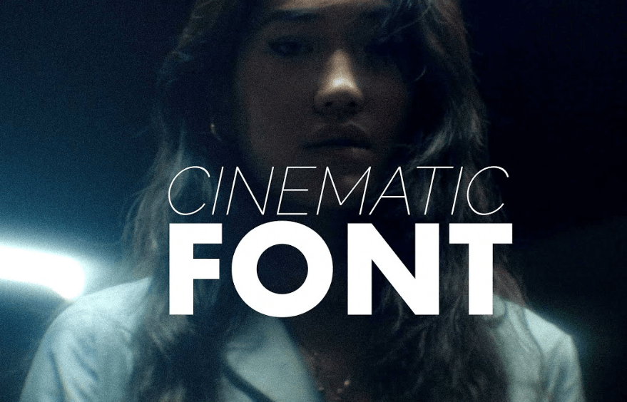
In the world of cinema, every visual detail contributes to storytelling—costumes, lighting, set design, and especially typography. Among these elements, movie fonts hold a unique power. They not only present the title of a film but also set the tone, evoke emotion, and create a lasting brand identity. From horror to romance, science fiction to drama, the fonts used in movie posters, trailers, and logos help define the visual language of a film. This is how movie fonts play a central role in shaping iconic cinematic branding.
Setting the Tone Before the First Scene
The first impression of a movie often comes not from a scene or a trailer, but from the font on its poster or title card. Fonts can instantly convey genre, mood, and era. A gritty, distressed font might suggest a dystopian thriller, while a flowing script hints at a romantic drama. For example, the sharp, clean lines of the Inception title font align perfectly with the film’s modern, psychological themes. The font prepares the viewer emotionally before they even step into the world of the story.
Establishing Brand Identity
Movie fonts are a core part of cinematic branding. A film’s typography appears not only on posters but also across trailers, merchandise, digital platforms, and social media. This repetition helps reinforce recognition and attachment. Just as logos define brands in the corporate world, movie fonts anchor the identity of a film in the audience’s mind.
Take the Star Wars franchise as an example. Its bold, tilted yellow title font has remained largely consistent for decades. Even without the iconic theme music, the font alone evokes instant recognition and nostalgia. Similarly, the handwritten font used in The Notebook visually reinforces the romantic and vintage tone of the film, enhancing its emotional pull and marketing appeal.
See also: Norsk IPTV: The Future of Entertainment and Sports Streaming
Communicating Genre and Style
Each film genre tends to align with specific font styles. Horror films often use sharp, jagged, or distorted fonts to communicate fear and unease—like the serif-slash look of the Friday the 13th logo. On the other hand, comedies frequently use playful, rounded, or cartoonish fonts to indicate light-hearted content. Science fiction movies opt for clean, futuristic sans serifs, while period dramas lean into elegant serif fonts to suggest tradition and history.
By choosing genre-appropriate fonts, filmmakers instantly signal what audiences can expect. This visual shorthand is crucial in marketing campaigns where viewers may only glance at a poster or thumbnail image. The right movie font speaks volumes—instantly.
Building Franchise Recognition
Consistency in font usage is key to building long-term cinematic brands, especially in film series and franchises. Consider Harry Potter—the lightning bolt-shaped letter “P” became synonymous with the entire series and remains instantly recognizable even out of context. When movie fonts are designed to be memorable and distinct, they become symbols that fans rally around.
This is true not only for titles but for taglines, sub-brands (like spin-offs), and promotional campaigns. A well-chosen font ensures that all visual elements of a franchise look cohesive and professional.
Typography as a Creative Extension
Sometimes, movie fonts are crafted as custom typography—tailored specifically to the film’s world. These custom designs act as a creative extension of the director’s vision. For example, the blocky, retro-inspired font of Stranger Things (though technically a series) channels 1980s horror novels and films, immersing viewers in a nostalgic atmosphere from the start.
This level of detail shows how fonts are not merely decorative, but integral to the narrative and branding strategy. A distinctive movie font can become as iconic as the characters or music.
Conclusion
Movie fonts are far more than letters on a screen—they’re powerful storytelling and branding tools. By setting tone, signaling genre, enhancing recognition, and supporting franchise identity, they shape how audiences perceive and remember films. Whether subtle or bold, traditional or custom-made, the right movie font ensures that a film doesn’t just tell a story—it leaves a lasting visual mark.